I'm posting some more older work. I don't have the resources at this very moment to upload newer pieces (or, I should say, newer "pre-pieces"), but soon I shall kidnap a scanner for my own dirty uses! I'm really enjoying words like "kidnap" and "hijack" lately. I think it's because I just watched "Domino," which was an absolutely horrible movie, but kind of awesome at the same time, like a visual orgasm of mtv imagery. Anyway, the following pieces are part of a series that I started with the intention of expanding over time, but alas, I ended up discarding for lack of interest.
Theses pieces were based on the store windows lining Nicollet "Eat Street" Ave. in Minneapolis. Eat Street, for those of you who are unfamiliar with this area, is filled with the most amazing little ethnic restaurants and grocery stores. There's a heavenly bakery called Marissa's that sells fresh pastries and cream cheese filled pockets of happiness! Wonderful.
For my project, I picked several windows that I was especially drawn to, and mentally removed a lot of the hustle and bustle of merchandise, because quite frankly, some of those windows were aesthetic overloads. So I simplified the image and decided I wanted to incoporate text into the pieces. I spent a lot of time at the library researching Chinese, Japanese, Arabic and Hmong writing and characters. Arabic writing is so beautiful in design, and I was very pleased with the way it worked with the other elements of the following piece:

Eat Street 1, oil on canvas, 24" x 24", 2004
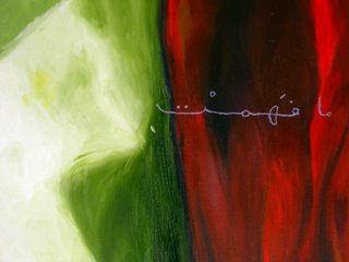
DETAIL
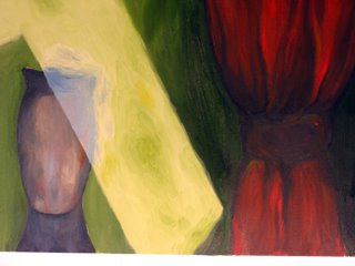
DETAIL
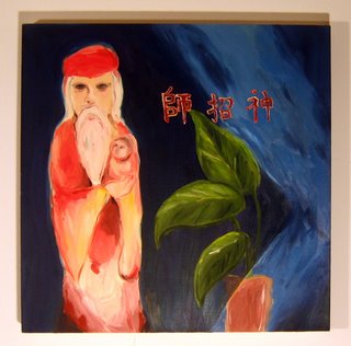
Eat Street 2, oil on canvas, 24" x 24", 2004
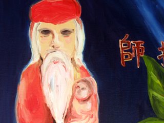 DETAIL
I should also mention that I used this project to try out different stylistic approaches as well. For Eat Street 1, I focused on a more traditional painterly quality, and for Eat Street 2 I incorporated bigger impressionistic strokes and less defining detail. I am not satisfied with the second piece. I wish I had taken it further, but at the time I thought I had a clear idea formed in my head of what I wanted it to look like (never trust a solid plan, I think).


 DETAIL
 Self-Portrait, charcoal on paper, 2005
 Self Portrait, oil on canvas, 2004
 Untitled, watercolor on arches, 2002
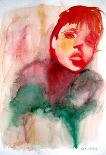 Untitled, watercolor on arches, 2002